Unveiling the limited-edition Archiv Collection, a new collaboration between Pamono and the venerable KPM
Maker’s Mark
-

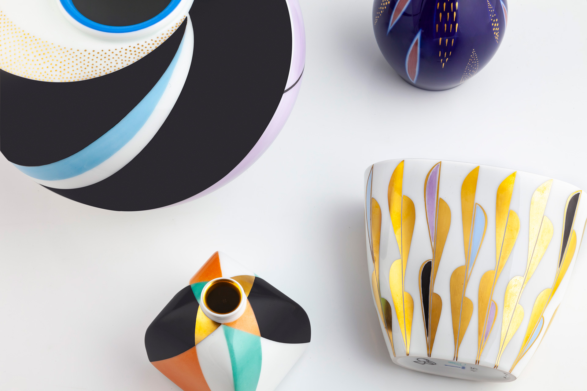
The Pamono x KPM Archiv Collection, 2018
Photo © Ramtin Zanjani for Pamono
-

Königliche Porzellan-Manufaktur (KPM) in Berlin
Photo © Ramtin Zanjani for Pamono
-

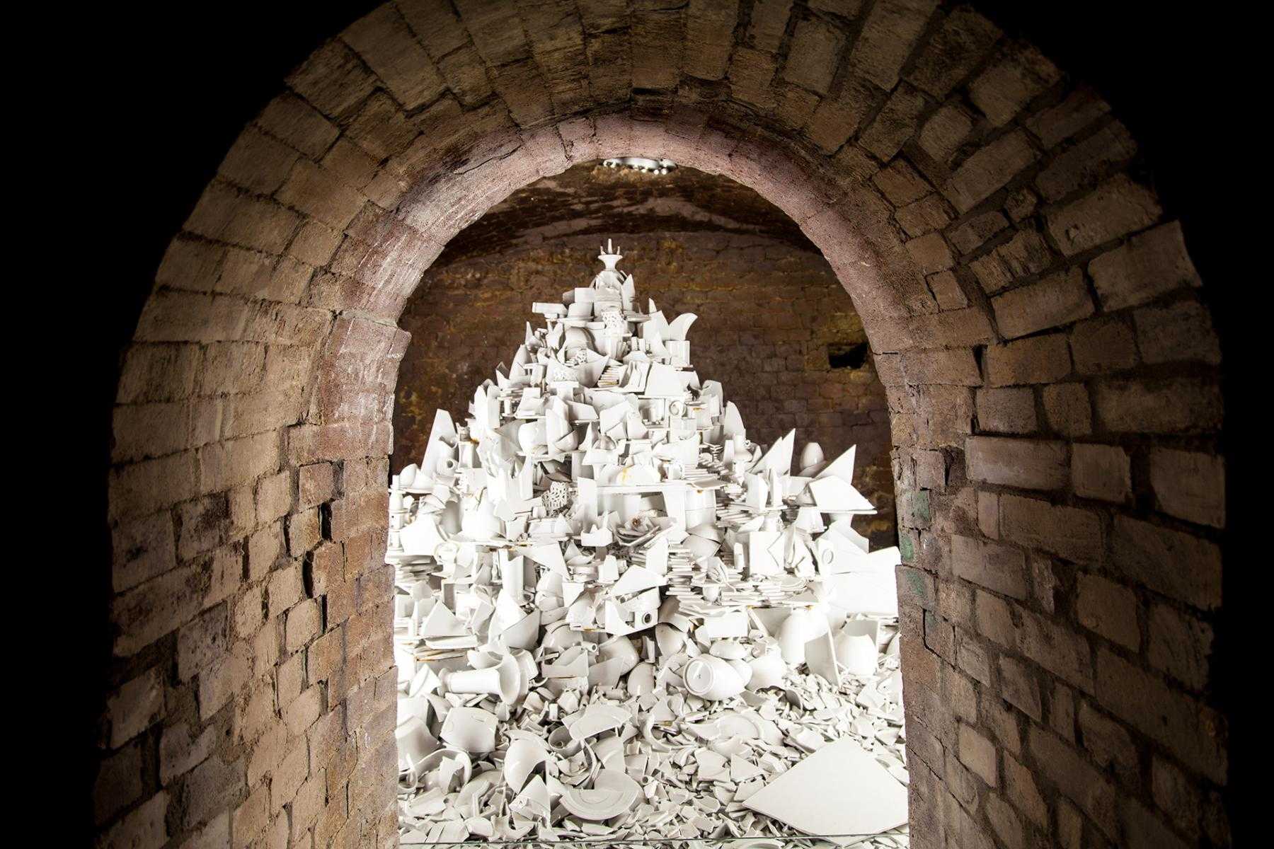
KPM's collection of broken ceramics on view at the visitor center
Photo © Ramtin Zanjani for Pamono
-

Inside KPM's painting studio
Photo © Pedro Gething for Pamono
-

Astrid Schulz, long-time KPM painter, in conversation with Pamono's Emma Lucek
Photo © Pedro Gething for Pamono
-

Learning about the handmade processes behind KPM's porcelain
Photo © Pedro Gething for Pamono
-

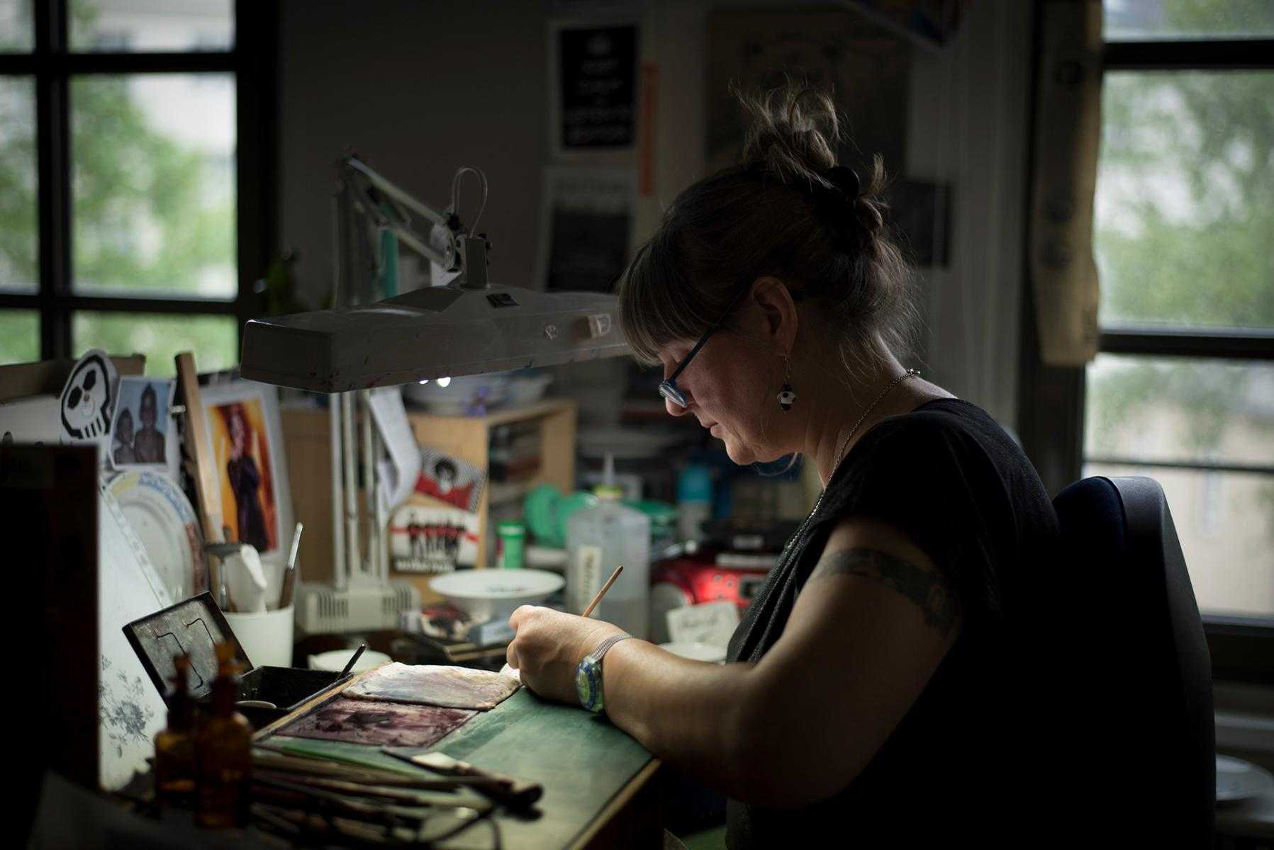
KPM painter Astrid Schulz at work on the Pamono x KPM Archiv Collection
Photo © Pedro Gething for Pamono
-

KPM painter Astrid Schulz at work on the Pamono x KPM Archiv Collection
Photo © Pedro Gething for Pamono
-

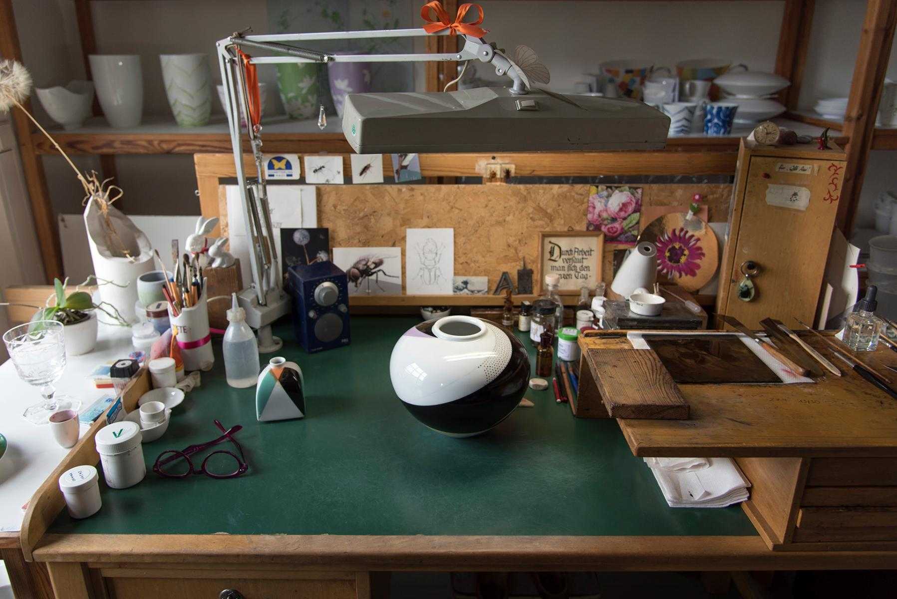
In process: the Onion Shape Vase from the Pamono x KPM Archiv Collection
Photo © Pedro Gething for Pamono
-

The Onion Shape Vase from the Pamono x KPM Archiv Collection, 2018
Photo © Ramtin Zanjani for Pamono
-

In process: the Bottle Shape Vase from the Pamono x KPM Archiv Collection
Photo © Ramtin Zanjani for Pamono
-

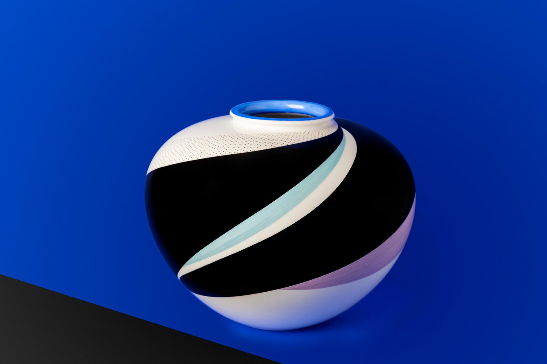
The Bottle Shape Vase from the Pamono x KPM Archiv Collection, 2018
Photo © Ramtin Zanjani for Pamono
-

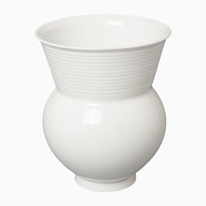
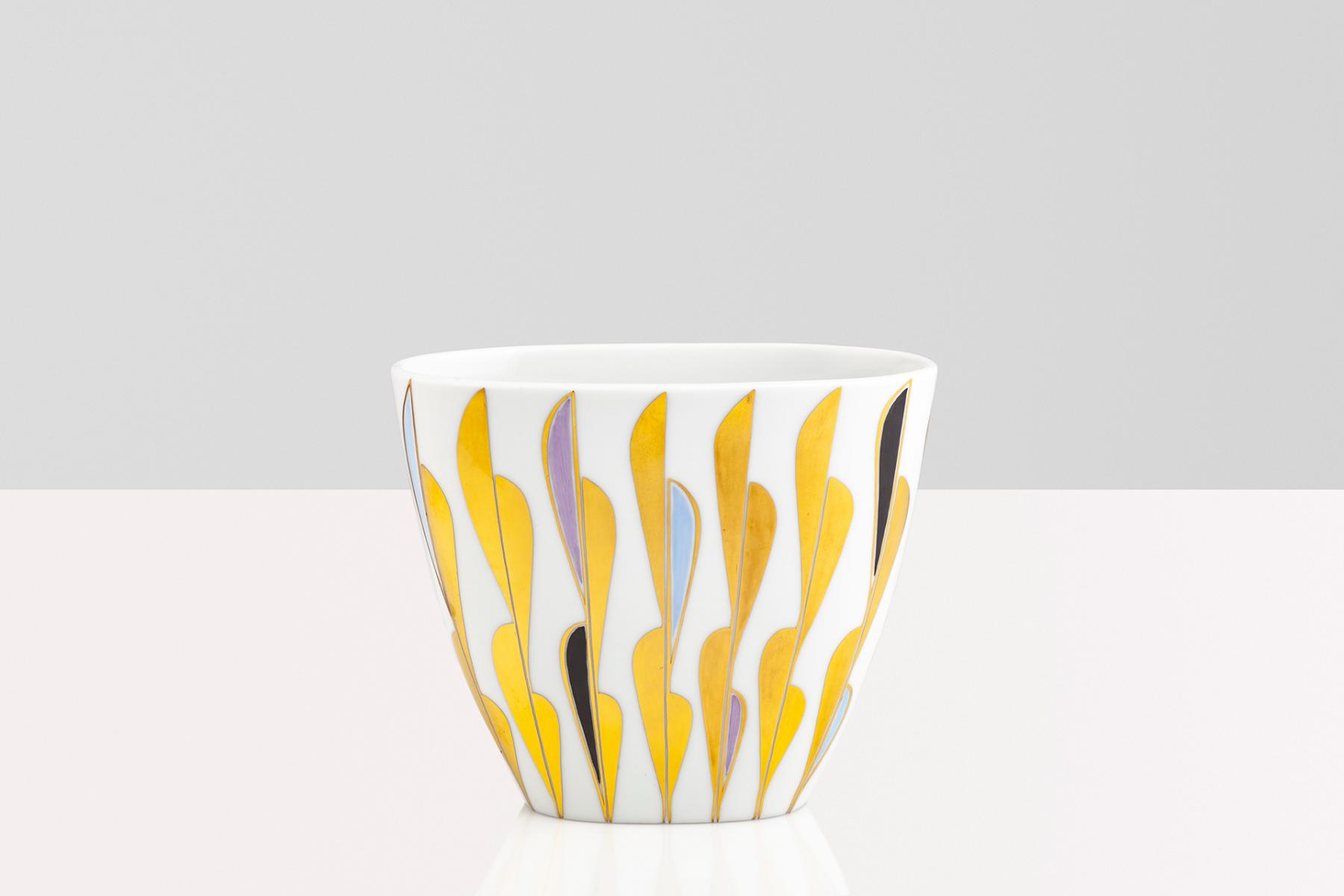
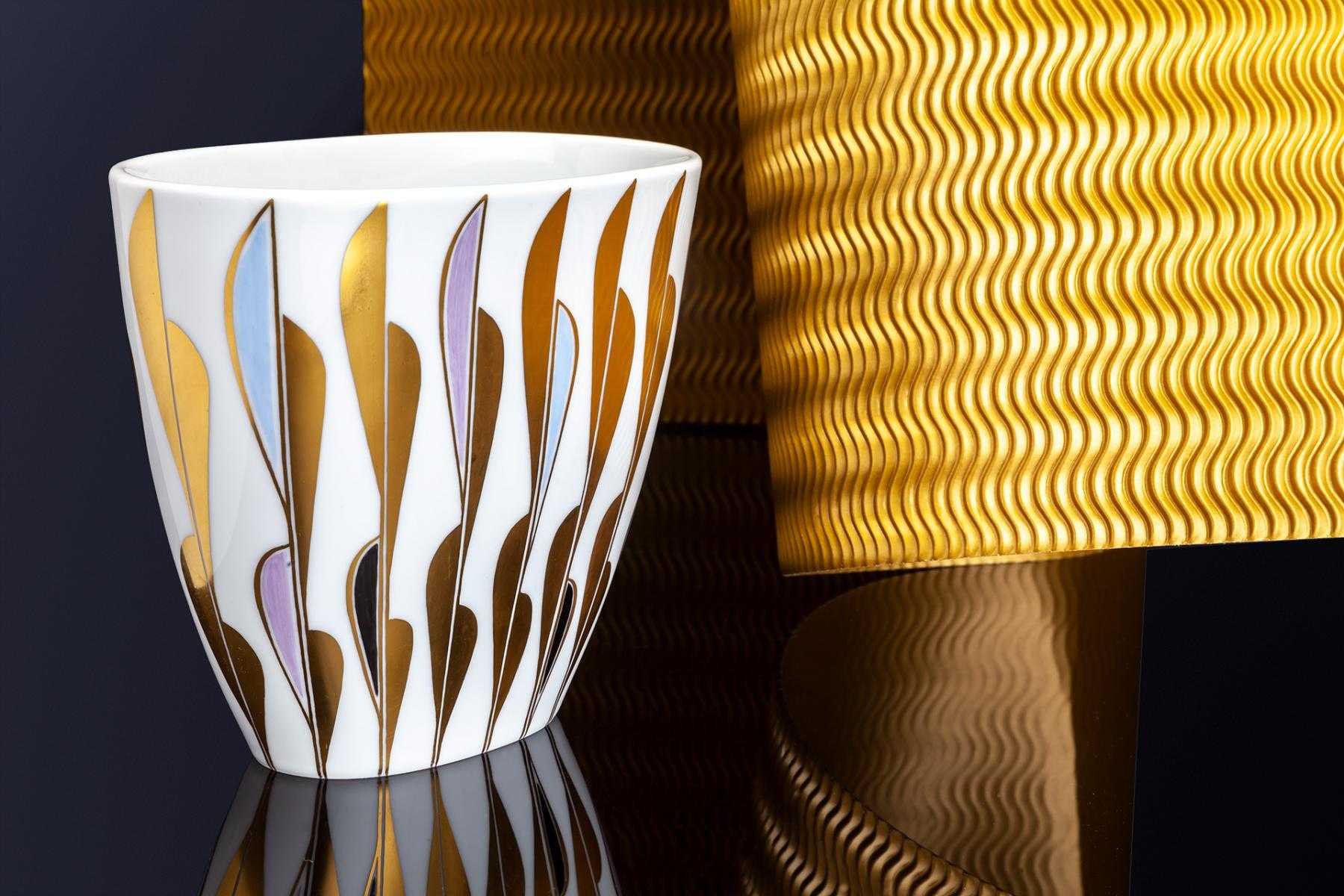
The Flowerpot Shape Vase from the Pamono x KPM Archiv Collection, 2018
Photo © Ramtin Zanjani for Pamono
-

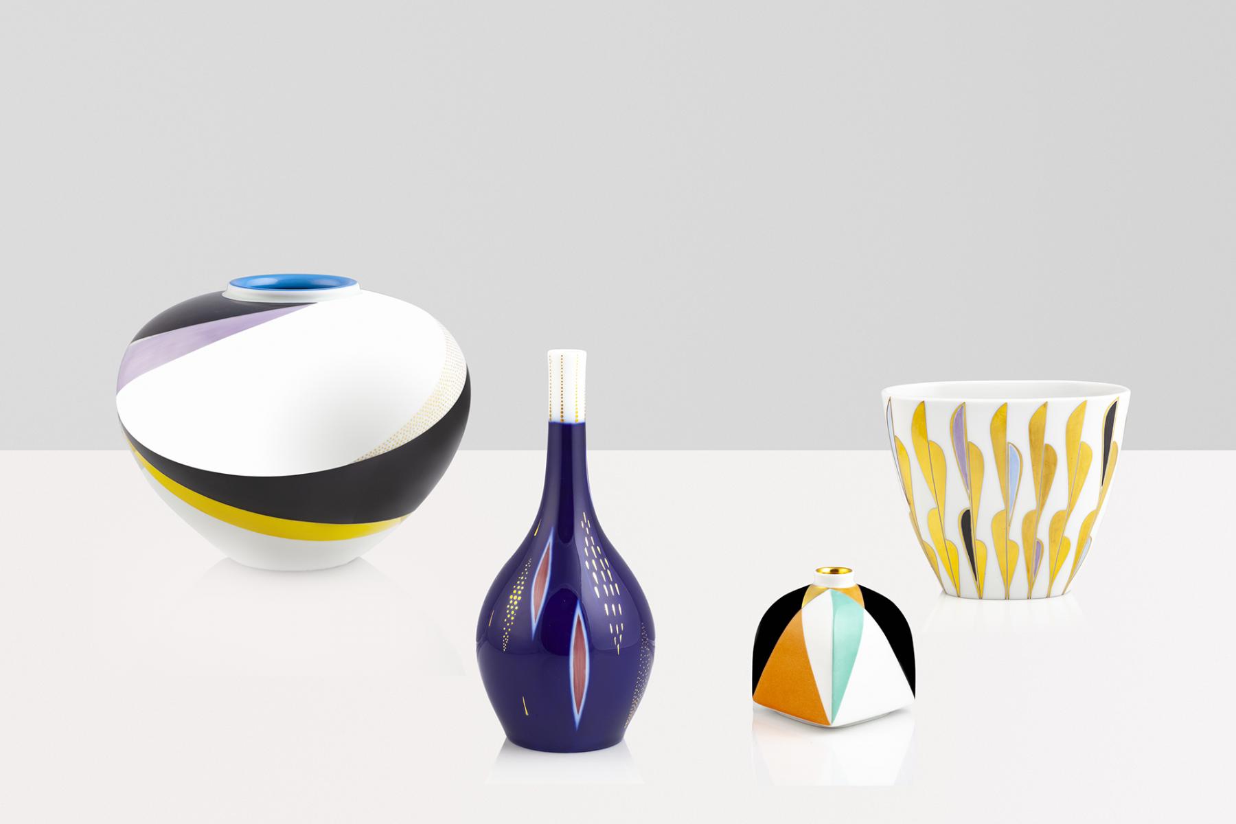
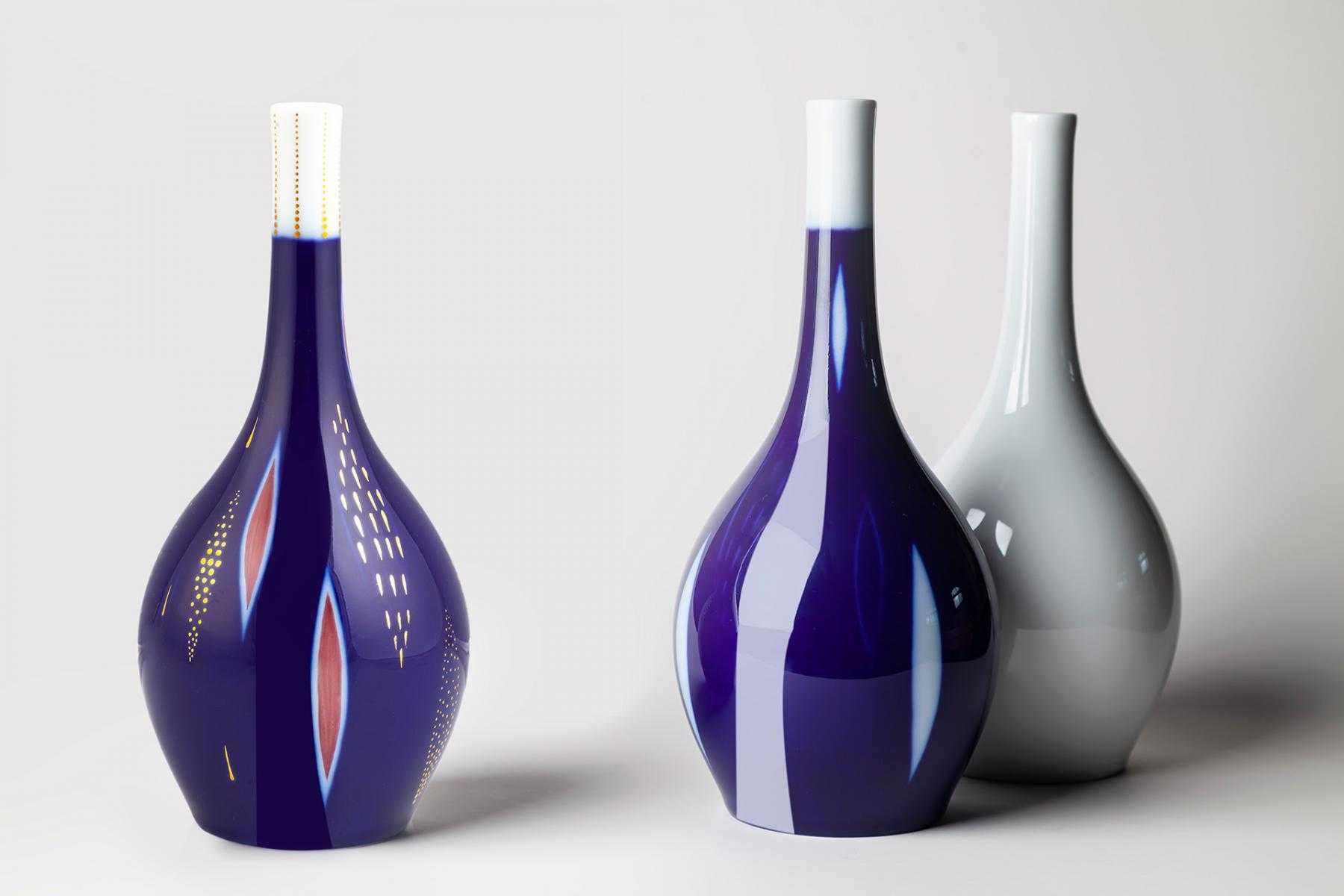
The Pamono x KPM Archiv Collection, 2018
Photo © Ramtin Zanjani for Pamono
-

The Pamono x KPM Archiv Collection, 2018
Photo © Ramtin Zanjani for Pamono

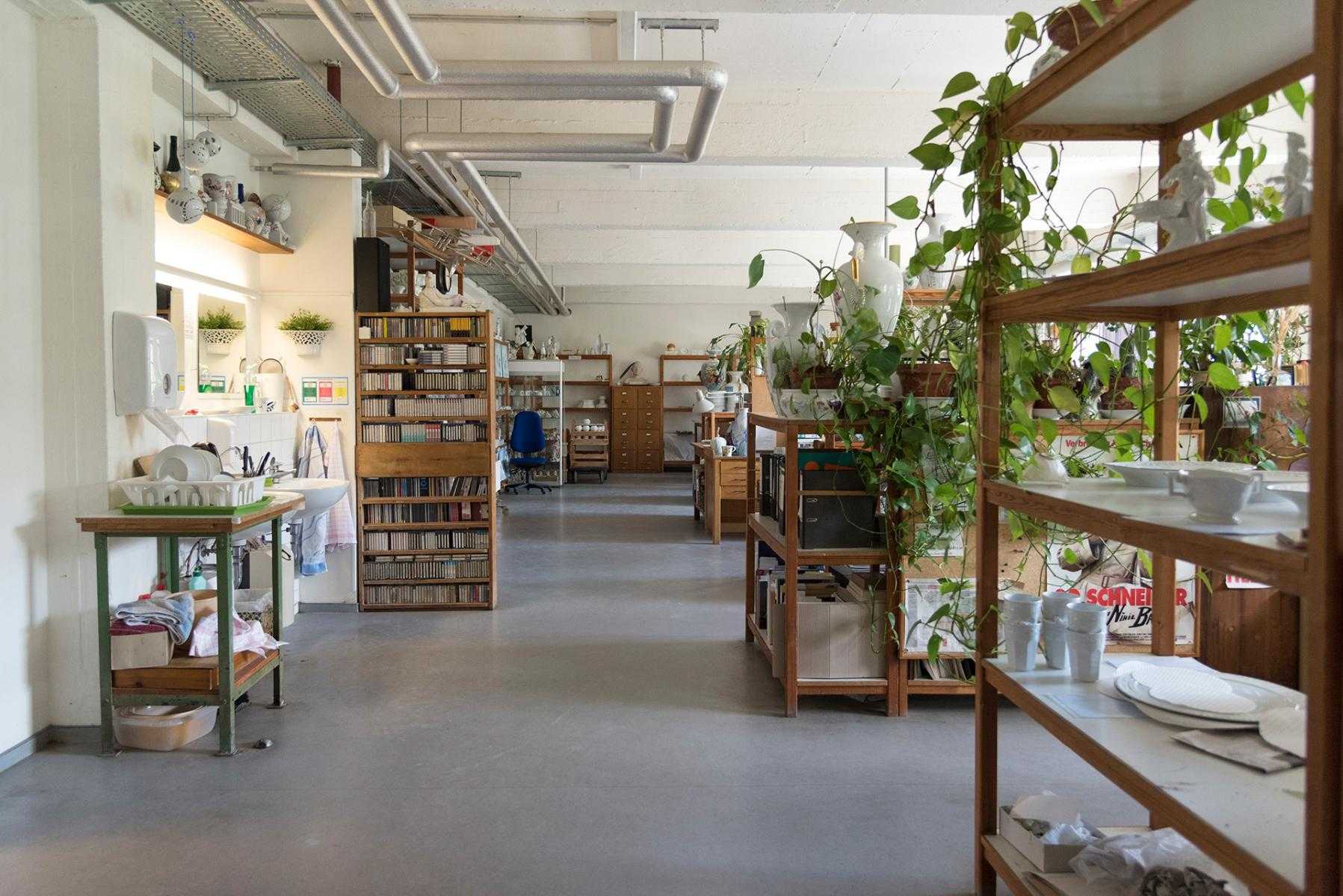
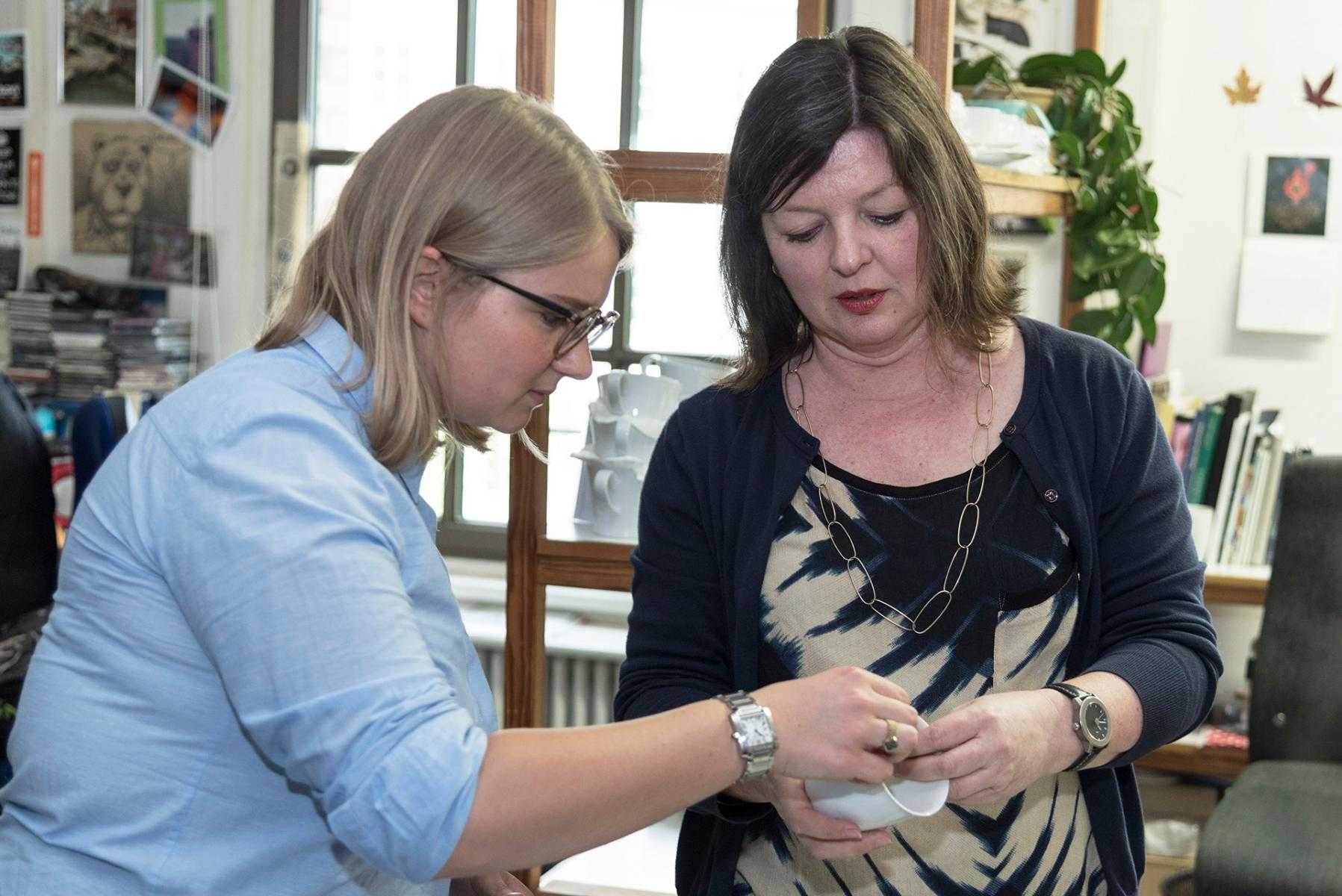


As we ascend the school-like, linoleum-clad staircase and step into the quiet hallway of the artist studios at KPM, we experience a shift in atmosphere; quite a change from the controlled elegance of the showcase area of the historic kiln hall—now a museum and visitor area—on the Berlin-based porcelain manufactory’s ground floor. Ushered into one of the work rooms, filled with light and greenery, we are welcomed by Astrid Schulz, who looks up from the vase she’s currently working on.
It’s a long, narrow room with eight desks parked against the windows, each workspace divided by standing shelves overrun with an eclectic mix of ceramics waiting to be painted. The oblique morning sunlight casts shadows of vessels and figurines across the floor. Astrid is the in-house artist who is hand-painting the collection of vases that is the fruit of a new collaboration between Pamono and KPM.
The Pamono x KPM Archiv Collection comprises four designs that our own Editor-in-Chief, Wava Carpenter, selected from the KPM archives—designs that haven’t been produced by KPM since the last century, between 1908 and the 1951. Each of the four Deco-esque vessels will be offered exclusively on Pamono in a collectible edition of five. Wava was drawn to these particular designs—out of hundreds of beautiful options—because they represent an uncharacteristic moment in KPM’s long history, which she explains, “embraces a trend toward modern yet glamorous, vibrantly hued graphic abstraction.” She adds, “The color palettes may be nearly one hundred years old, but they feel strikingly contemporary.”
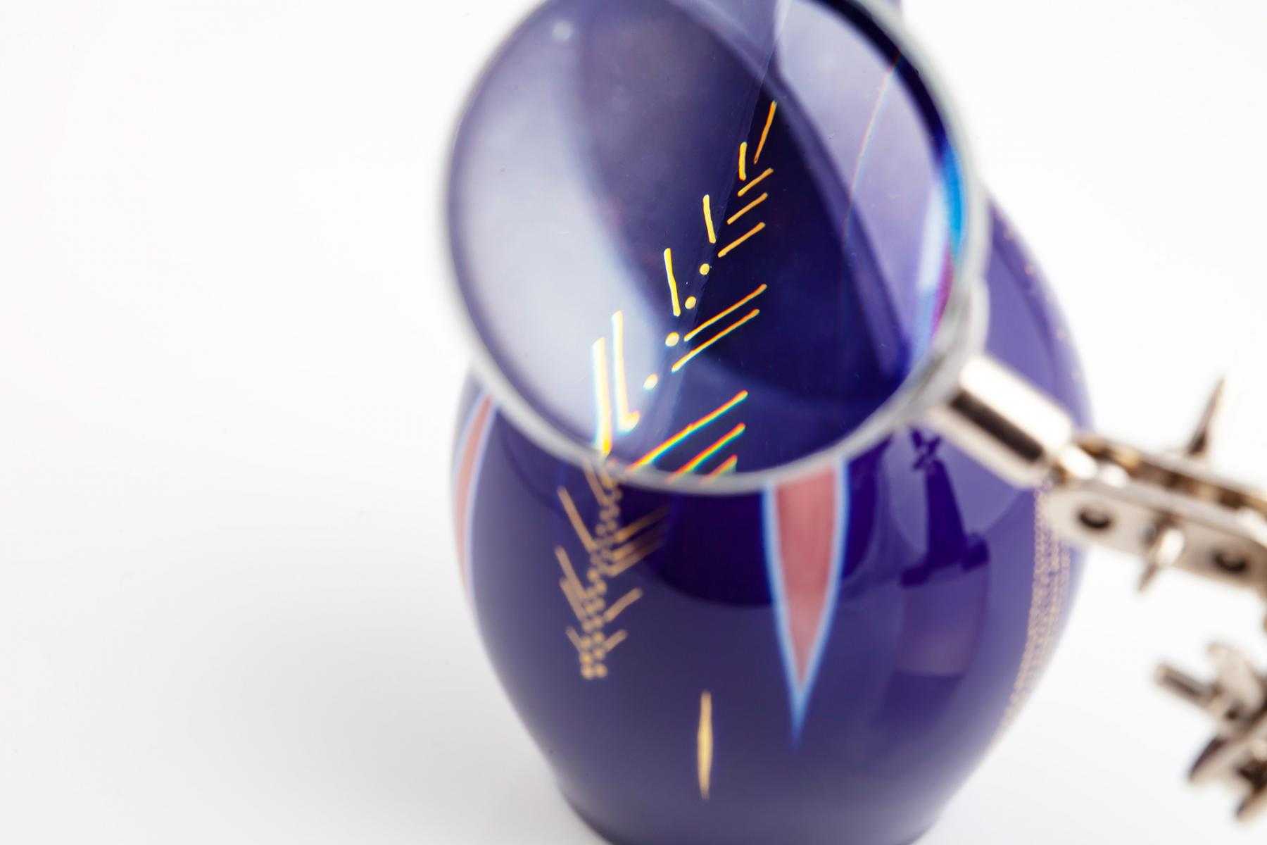
During our visit, pieces from the Archiv Collection are standing on Astrid’s desk at various stages of completion. The one she is currently working on—the Onion Shaped Vase designed by Trude Petri in 1935—has a particularly Art Deco vibe. Astrid’s L-shaped desk is strewn with very fine brushes, sponges, pigments, print-outs of the designs annotated with precise markings, and the ‘template’ that she created for the vase at hand. This template is made of slivers of rice-paper that mark out the vertical distances between the horizontal lines of the organic design swirled around the curves of the vase. Aside from this self-made guide, the rest of the painting process depends very much on her steady hand, muscle memory, her trained and confident gestures, and the forgiving nature of the painting process; anything that hasn’t yet been fired can be wiped off with spirit alcohol. However reassuring that may be, given Astrid’s 35-year tenure at KPM, she does not need to make erasures much.
There is a moment during the interview when we let the information that Astrid shared with us about kiln temperatures, negative-space painting techniques, and glaze consistencies settle. I look at Astrid standing in her studio, artistic chaos and ceramic pieces all around her. Behind her is a tall, burdened shelf, filled with what looks to be Astrid’s favorite KPM designs. I ask to confirm. She jokes under her breath that her favorite pieces have walked out with her long ago. On a more serious note, she’s tells us that she’s especially fascinated by variations in blue pigments and how different firing temperatures influence the crispness of the outlines of color. A challenge she is enjoying with our collection is re-creating the intensity of the pigments used in the original designs, given that they were lead-based and no longer permitted.
A painter by discipline and passion, Astrid was one of 400 applicants who vied for a position in the KPM painting studios when there was an open call in 1983. She was accepted as one of eight, despite never having had painted in the third dimension before. She tells us that the only thing she needed to adjust to when changing mediums was learning how to position the objects in order to paint on them. Her artist-neighbor motions to a foam-coated, metal contraption next to her desk. It’s used to do just that—lean the delicate, round, and sometimes awkwardly-shaped ceramics for painting.
Each of the roughly 35 painters at KPM has a specialization—floral, landscape, figurative, or what Astrid refers to as ‘décor.’ This you may think is quite broad, which it is; but in essence, it encompasses surfaces designs that don’t depict reality. This is the abstract, graphic department—Pamono’s favorite of the moment.
Interestingly, however, this isn’t necessarily the most popular among KPM’s broad clientele. Their classic, opulent, elaborate, gold-laden, rococo aesthetic is still very popular with the Russian and Asian markets, to whom the catalogue we are shown is mainly directed to, with subtitles in Chinese, Korean, Japanese, and Russian. KPM’s classic collections feature designs from the late Art Nouveau period, pieces from Frederick the Great’s favorite service, and the floral, royal collection from 1767. Such pieces are still given as gifts by the Mayor of Berlin and other local diplomats to visiting dignitaries.
 The Pamono x KPM Archiv Collection
Photo © Ramtin Zanjani for Pamono
The Pamono x KPM Archiv Collection
Photo © Ramtin Zanjani for Pamono
This isn’t to say that KPM is stuck in the past—it boasts a series of contemporary, clean-lined collections with minimal ornamentation, as well as recent collections from the KPM+ line, which aims to keep KPM current through collaborations with high-profile, Berlin-based artists. Most recently among them is Mark Braun’s cosmos-inspired collection Planetarium.
While it’s quite unusual to have a porcelain manufacturing facility in the middle of a large city, KMP sits in the bustling district of Charlottenburg, on the west side of the city’s green-lung that is the Tiergarten. Astrid, originally from Berlin, can’t imagine the KPM HQ anywhere else. Given the way its complex neatly fits into the neighborhood, and seeing how it’s been in Berlin since its inception, Berlin and KPM are forever intertwined. Despite now being privately owned, the name given by Prussian king Frederick II in 1763—Königliche Porzellan-Manufaktur Berlin—still stands, as does the royal cobalt scepter trademarked symbol. Pamono, a much younger Berlin-based design business, is delighted to be weaving into the history of this emblematic institution. It’s been our pleasure and privilege to meet some of the outstanding talents behind the Pamono x KPM Archiv Collection.
-
Photos by
-

Ramtin Zanjani
Beyond his role as Pamono’s Head of Photography, Ramtin has honed his keen eye through years of product shoots, art direction, advertising, and documentary work. He doesn’t like to talk about it, but he has some searing photographs available at SaatchiArt.com.
-
-
Text by
-

Emma Lucek
A British-born Pole currently based in Berlin, Emma has a background in research and design. In addition to being Pamono's Design Editor, lately she's been working on critical writing in the fields of art, architecture, and cultural theory, as well as design journalism.
-
More to Love
Hansa Tin by Trude Petri for KPM Berlin, 1950s
Tableware Set by Siegmund Schütz for KPM Berlin, 1950s
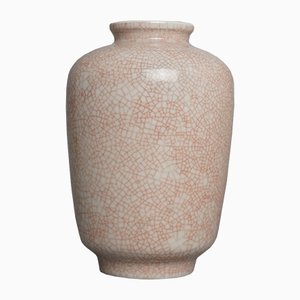
Vintage Grey Heart-Shaped Vase with Craquelure by Trude Petri for KPM
Halle-Form Vase by Marguerite Friedlaender for KPM, 1930s
Vintage Ship-Shaped Flower Vase with Insert Holes by Siegmund Schütz for KPM
Bauhaus Vase by Marguerite Friedlaender for KPM Berlin, 1930s